Happy (almost) weekend!
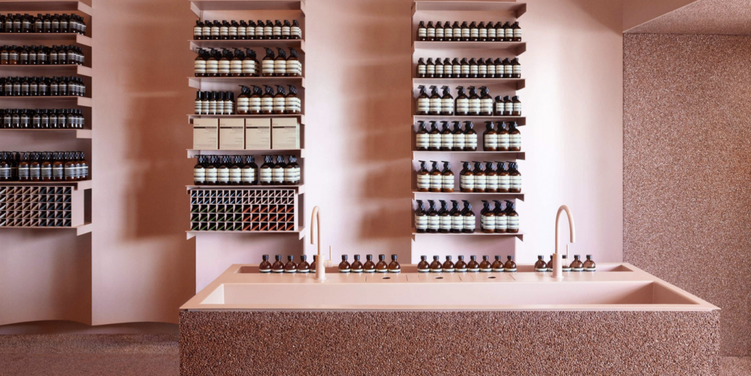
I have a design focused treat for you today. Have you ever walked into a retail store and from the sight of it you said: “I don’t even know what you sell, but I like it!?”
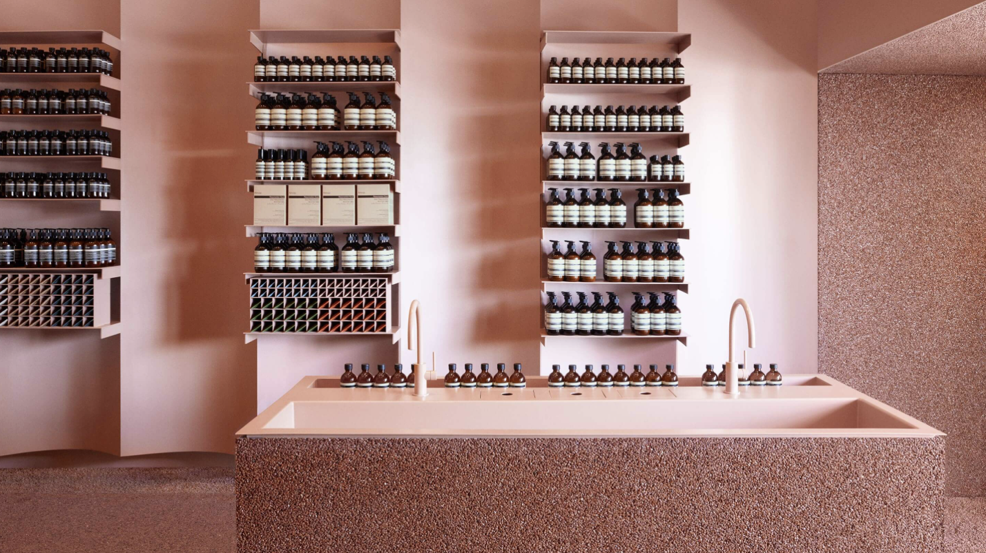
That’s what happened to me on a recent visit to UTC mall in La Jolla. I stumbled upon the newly opened Aesop store. That first step inside hit all my senses. The heavenly smells of cedarwood and clove wafting through the air. The concrete and marble elements to run your hands along and the most amazing visual merchandising I have ever seen. I knew of Aesop but had yet to try any products so I was excited to learn more.
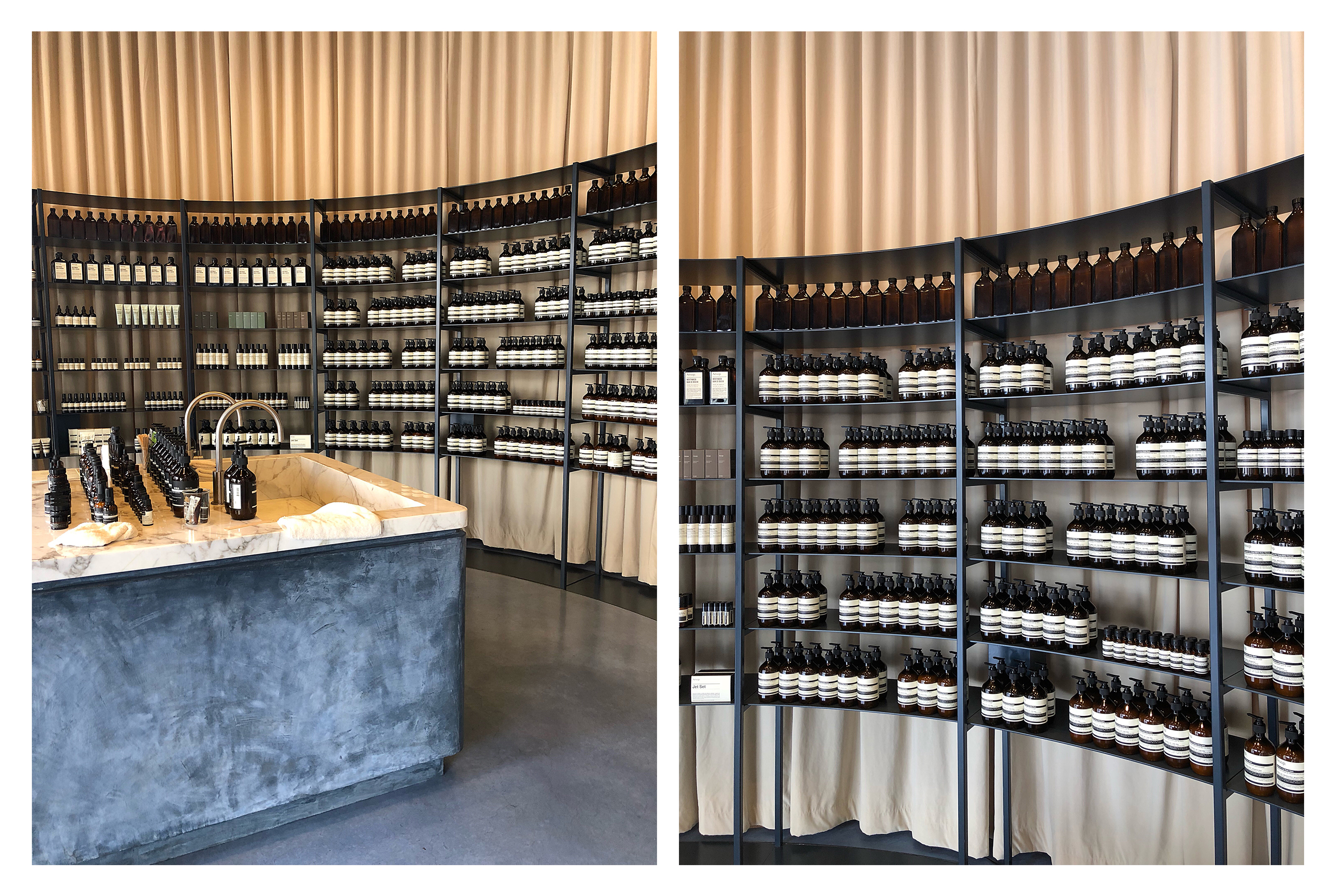
Aesop is a skin, hair and body care line created with meticulous attention to detail. What I experienced was they have a specific clientele they seek. The one who appreciates good clean packaging, limited waste, no marketing gimmicks, and just great ingredients.
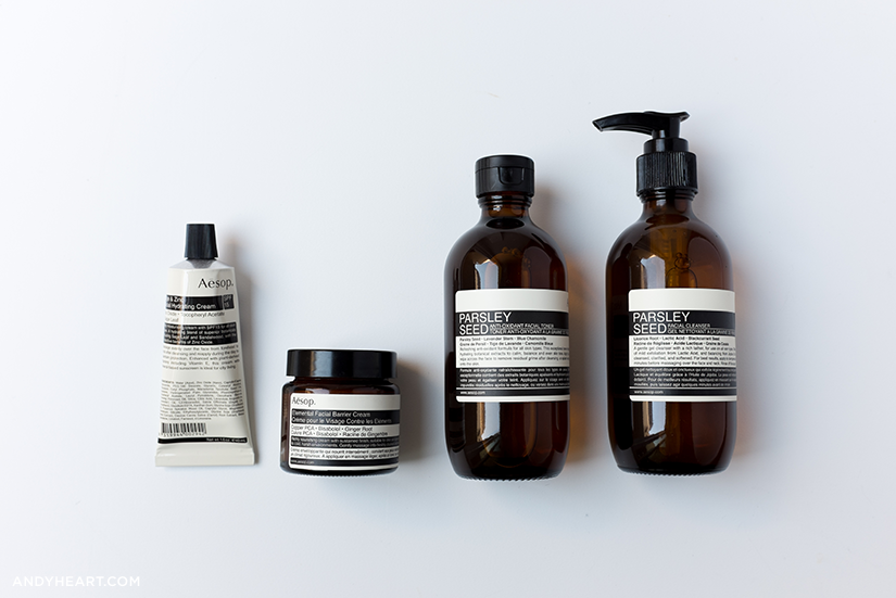
They are a natural brand who uses science when needed. I appreciate that, as sometimes coconut oil is not going to cut it for aging skin. Give me all the science!
The fresh-faced employee gave me a rundown of the skincare line. I don’t need shoes or handbags just give me great skincare, so I was all ears.
I tried the Parsley Seed face cleanser with lactic acid which I loved as it is a gentle exfoliator for every day. A must as we enter the season of dry skin. The camellia nut facial cream I have been using during the day as it is light and leaves a natural finish, no grease. I am always on the hunt for a good sunscreen with a high SPF and non-greasy for under make-up. I tried their protective SPF 50 body lotion and so far it has checked all the boxes and smells heavenly.

Since what brought me into the store was the impeccable design I had to learn a bit more. My search came to an interview from TheCut.com with Suzanne Santos their Australian brand manager.
For somebody who wanders into an Aesop store by chance, what makes that such a discovery?
Our visual marketing is often the first trigger for people — we don’t advertise, but the stores are an incredible marketing tool. There’s also the aromatic experience — we burn our oils in the stores all day. But one of the biggest differences is the caliber of the people that we employ, and the manner in which they communicate, educating quickly and offering solutions in a respectfully succinct way. Ultimately, it’s about ensuring the best end result for the customer.
“We believe unequivocally that well-considered design improves our lives.” – Aesop
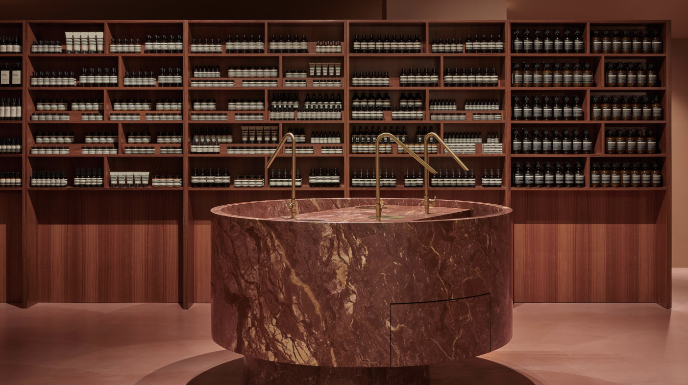
Look at all the mauve, brass, and that marble slab!
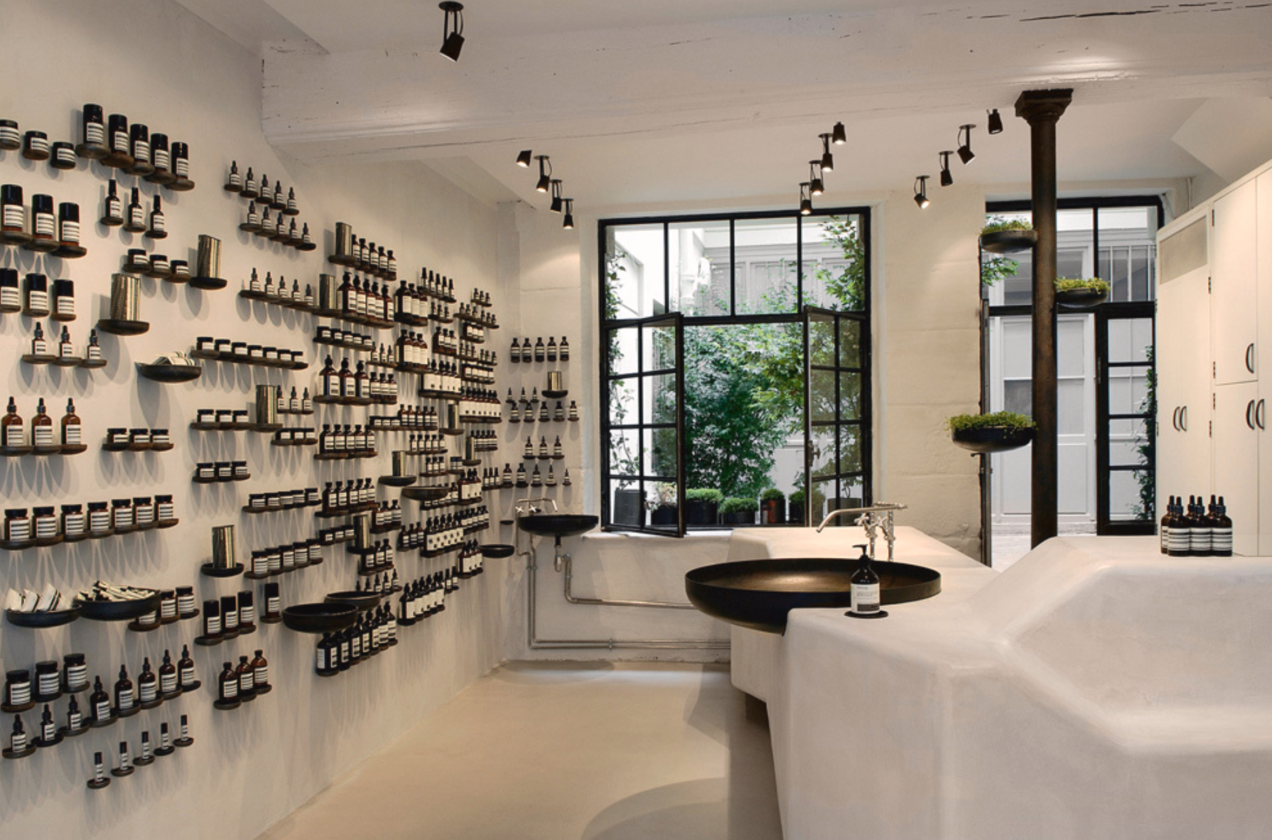
Stunning product wall in Paris.

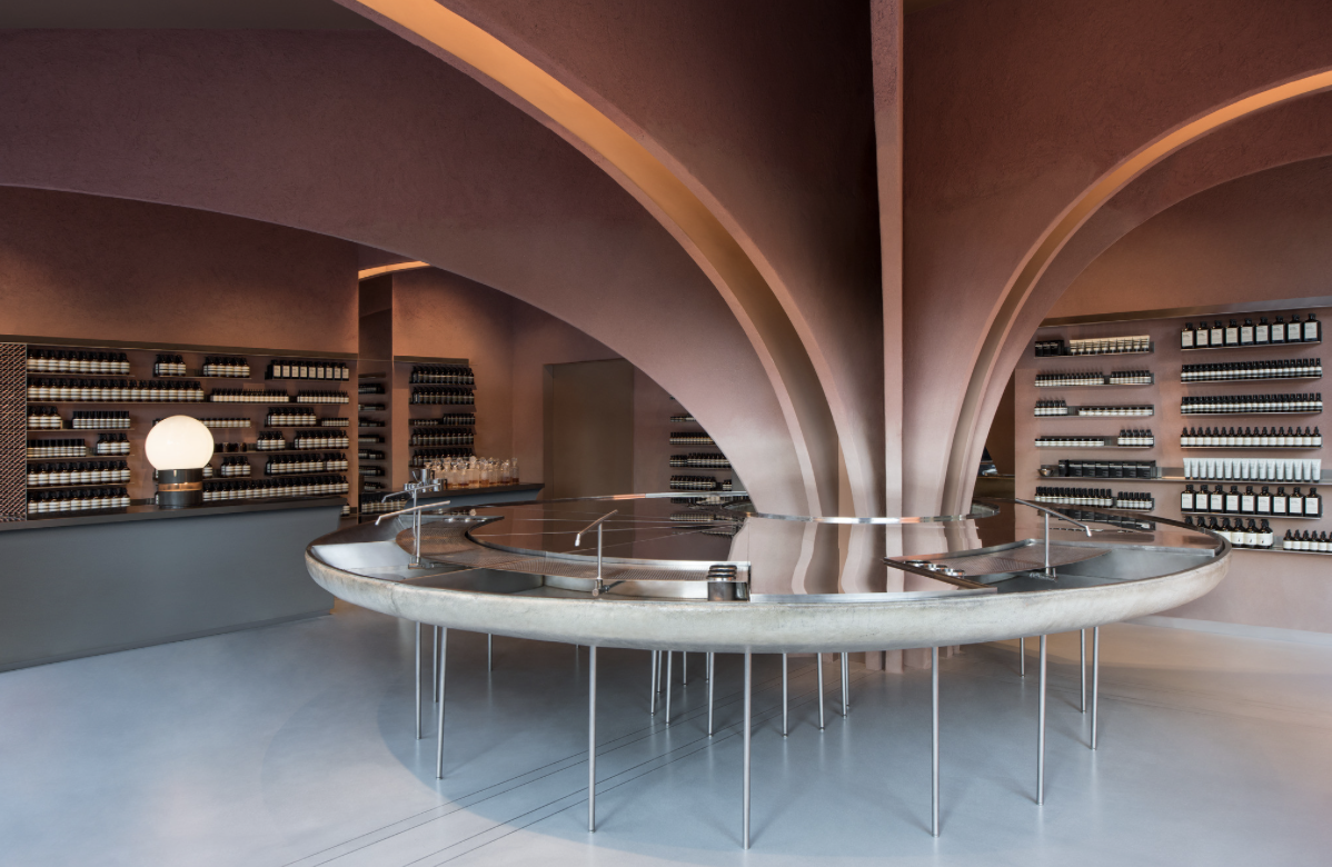
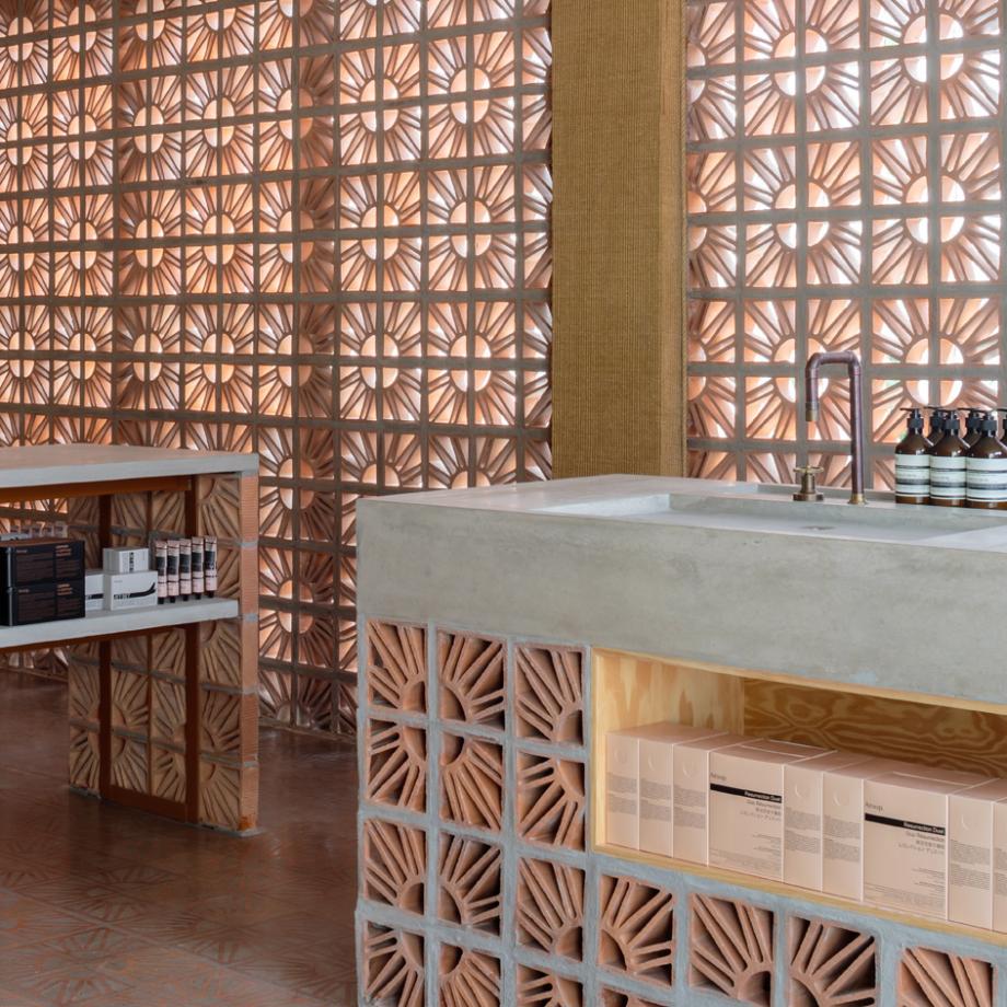
In love with the handmade brick used in a Sao Paulo, Brazil.
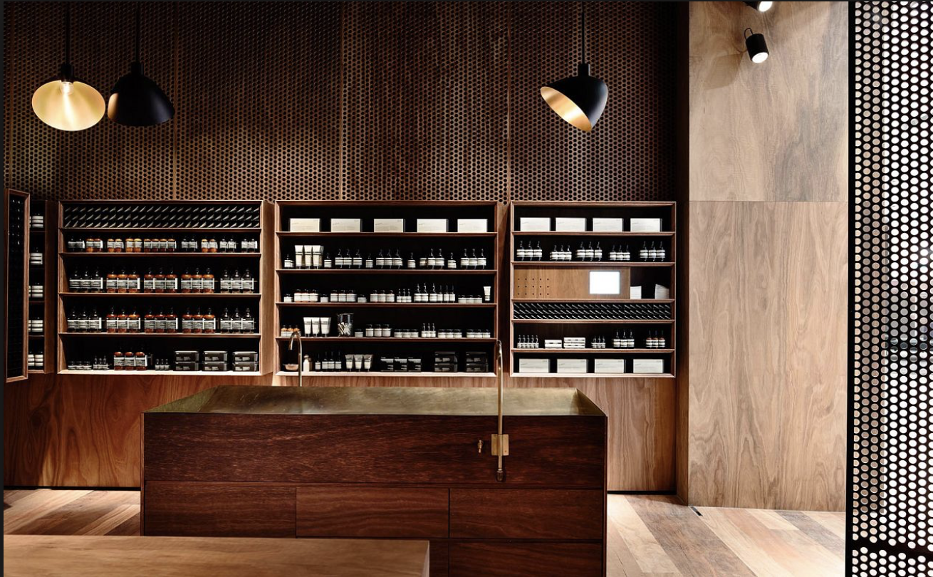
Lastly, the architect’s use of wood and honeycomb elements give this Melbourne Emporium location a warm and inviting feel.
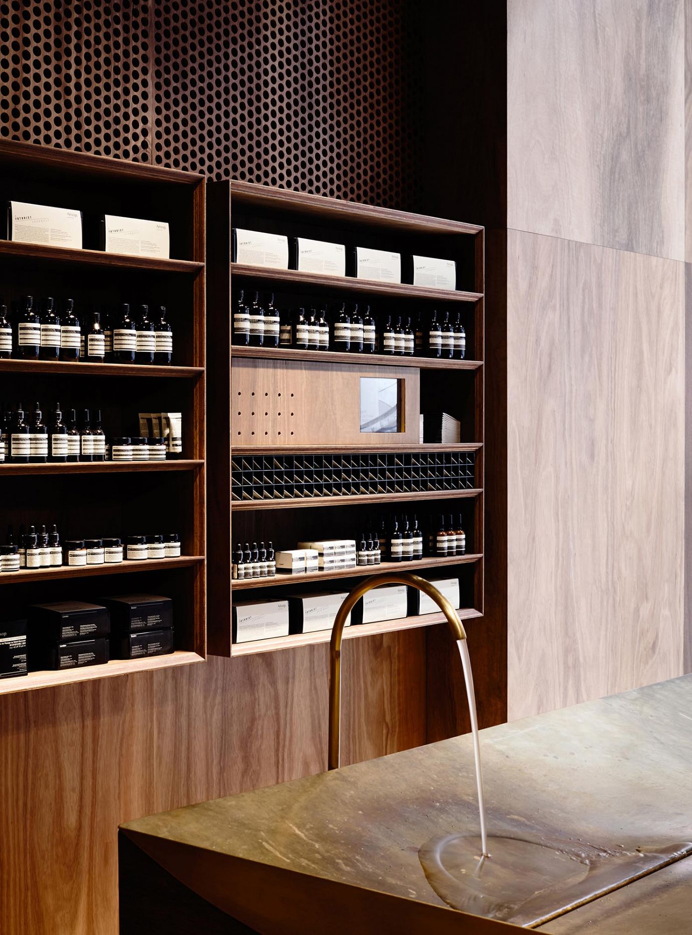
I now know to add an Aesop store visit to my list anytime I check out a new city.
So, have you tried Aesop products before? Or ever seen one of the stores I featured?
**All opinions in this post are my own and not sponsored. I just love to share good design and skincare brands with a purpose.
Images || Aesop
