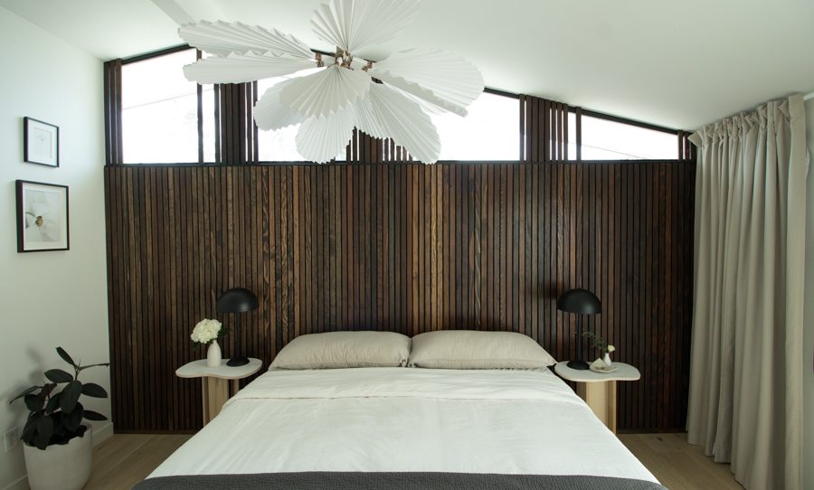
I can’t believe the day has come! After 7 straight weeks of designing, building, and DIYing my way to today, it’s officially time to share the whole master bedroom reveal with you!
First lets take a quick look at what I started with….
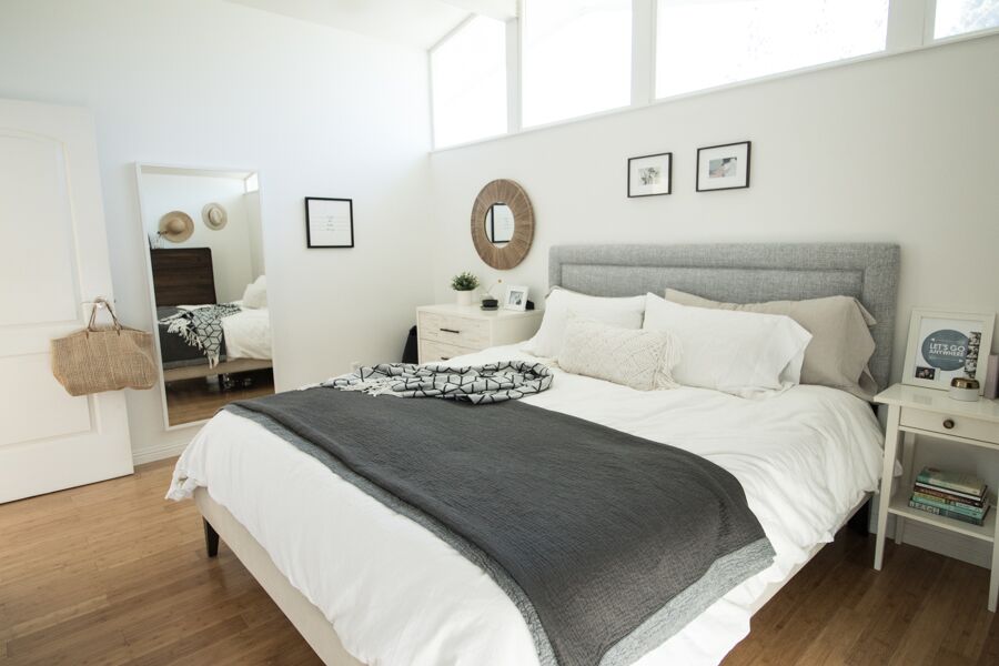
It was light and bright and mostly a blank canvas before.
One thing that doesn’t show in the before images is how much the two dressers made it feel cramped.
My goal for the room makeover was to make it feel open and minimal but still cozy. I love Scandinavian design and leaned my color palette towards neutral, textured and high contrast.
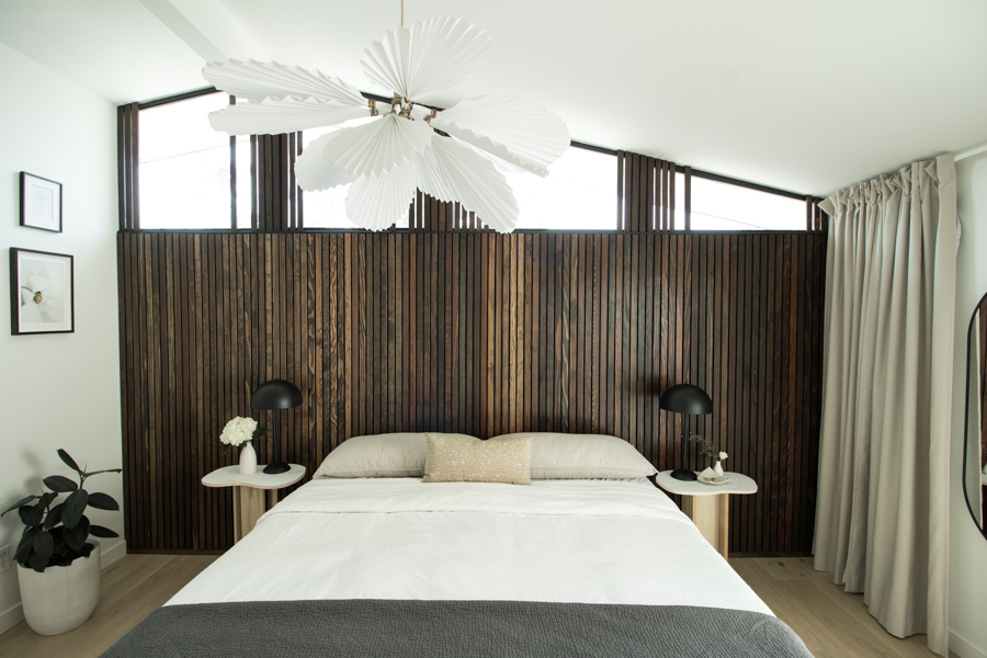
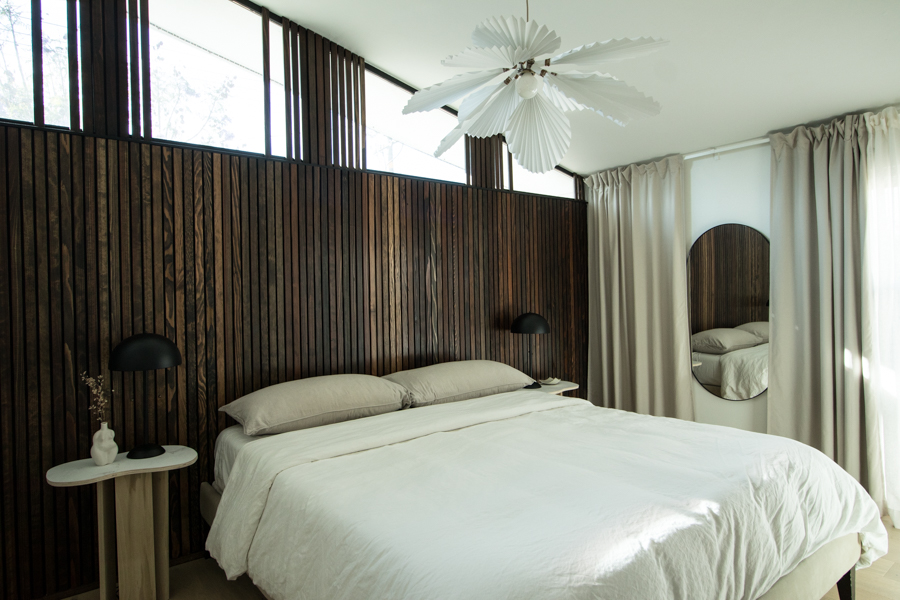
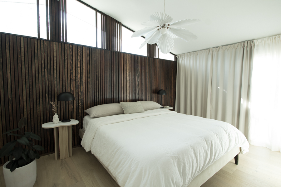
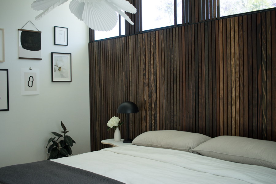
I love how the wood slat wall highlights the height of the room along with the clerestory windows. I didn’t want anything too stagnant and symmetrical so I played with the pattern a bit and after seeing it in images think I will add even more as I love the look!
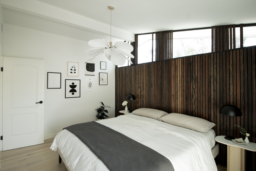
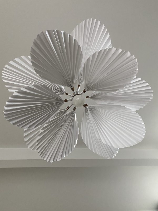
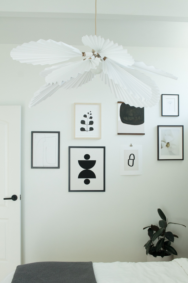
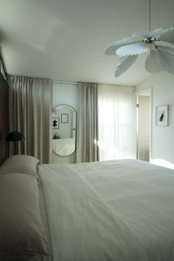
Lighting is hands down my favorite part of design. I love adding a bit of whimsy or unexpectedness to the room and I feel the paper chandelier evokes that. It was a relatively easy DIY with a big impact.

The view from bed is pretty amazing as it’s reminiscent of a big, beautiful bloom.
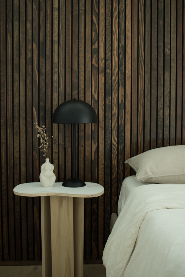
The richness in the dark wood tone creates such a vibe in the space. It helps it feel moody without being too dark. The wall was a labor of love and I definitely got my DIY hours in completing it but when I see the room all together it was so worth it.
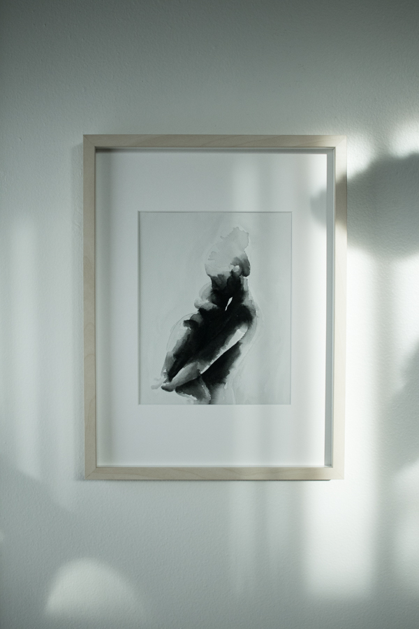
We don’t have a lot of wall space in our home so when one large wall was available I was looking forward to creating a gallery wall with minimal art prints. It’s a mix of downloadable art from Etsy that I had printed on heavyweight fine art paper like I use in my print shop. Up close the texture is just so good.
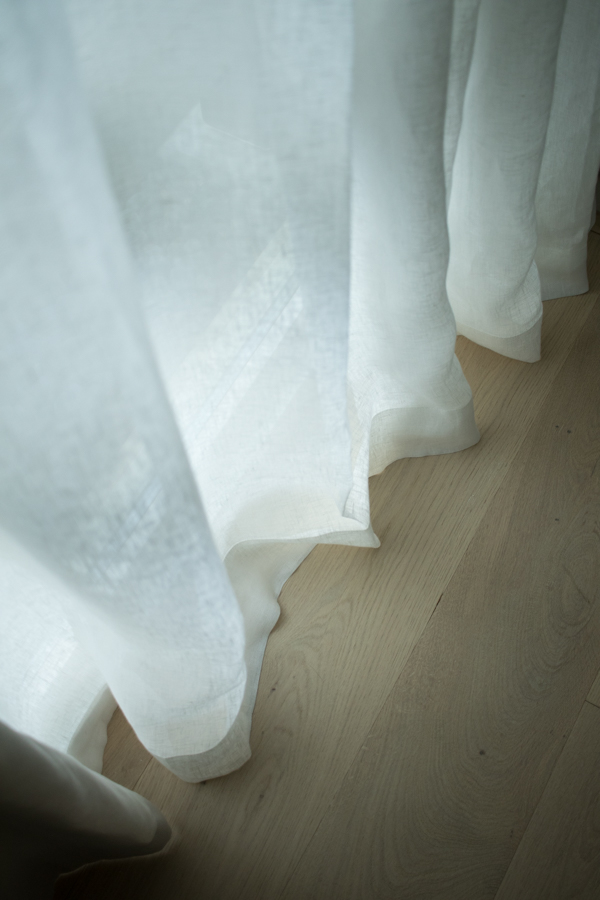
The linen and beige curtains add so much to the wall that the one awkward window is on. I used the Vidga track system from IKEA and think it made an otherwise boring wall interesting.
I hung the mirror on the curtain wall and keep it opened or closed depending on the mood. Although I am so in love with that mirror I can’t imagine wanting to hide it now.
We moved the dresser in the closet and it works great for now. I have plans to do a white oak custom wardrobe in the future. The curtain camouflages our shoes, hamper, and hanging clothes and bags.
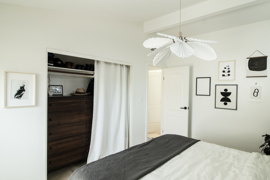
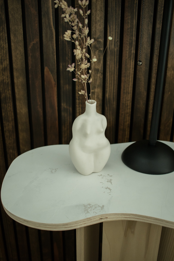
Carrying the wood treatment over the windows and the curtains to the ceiling made the room feel so much larger. Reducing the dressers keeps the floor open and minimal and a breeze to clean.
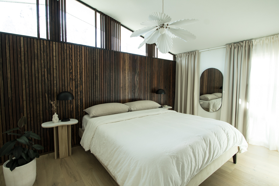
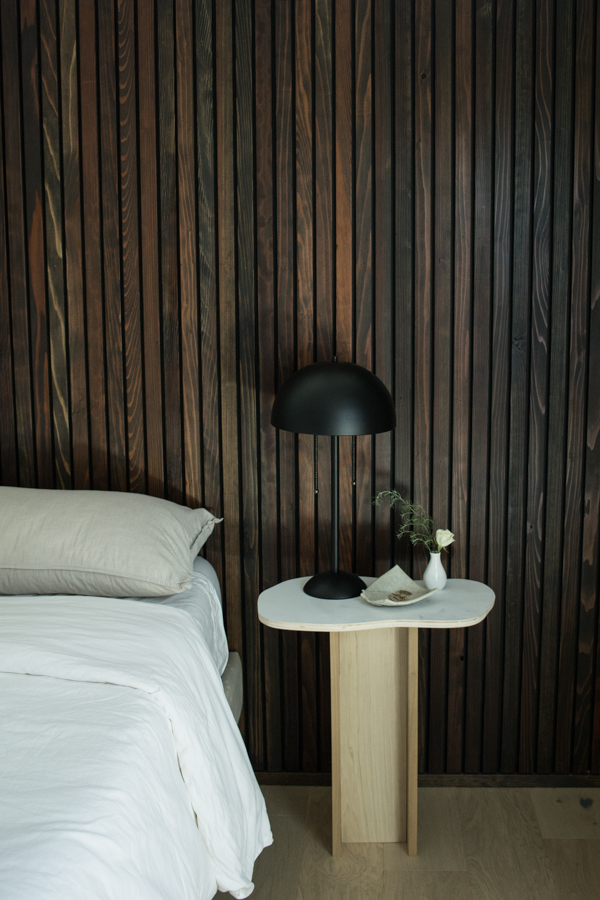
The bedside lamps continue the curved theme and give off great light for reading at night. They were a quick Amazon save when my original wall sconces ended up too large.
My DIY end tables fit in rather nicely! Not bad for re-purposing some photography backgrounds. I love the plaster texture and the curved edges. I like the mix of feminine elements like the paper pendant and accessories against the masculine wood wall. In a his and hers room I think it’s a good balance.
I couldn’t be happier with how it turned out! The room makes us feel like we are in a chic hotel in Europe. Hey, if we can’t jetset right not we can at least feel like it.
I started this challenge on a whim as a way to set focus and keep myself busy creatively while home during Covid with 2 kids. It turned into so much more. I connected with a community of like minded design enthusiasts and launched a YouTube channel along the way! Having a definitive end date definitely kept this project in motion and made sure it didn’t end up another half finished project.
If you want to see where this room all started head to weeks 1, 2, 3, 4, 5-6, and 7 to see the breakdown of projects.
Lastly, thank you to Better Homes and Gardens and One Room Challenge for hosting this! Be sure to check out the reveals of the 20 featured designers and many guest participants of the Spring 2020 One Room Challenge. You will definitely find inspiration!
Thanks for following along on this one!
xx Jennie
Linen Duvet – Restoration Hardware | Curtains- IKEA | Frames – IKEA | Wall Color – Dunn Edwards Whisper

